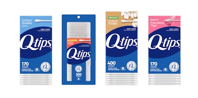
Iconic cotton swab brand Q-tips is moving into its second century with a fresh and modern look that puts the emphasis on the “Q” for quality in its name. Having achieved life hack-tool status second only to that of duct tape, the 101-year-old product has grown from its initial purpose as a ready-to-use cotton swab for baby care in 1923 to one used in applications as varied as pet care, beauty, arts and crafts, first aid, and more.
According to Olga Alpeter, associate brand director, Q-tips, Elida Beauty at Unilever, the new design was a year in the making and was done in collaboration with global brand agency 1HQ, which she describes as a “great partner in bringing the Q-tips design to life and balancing beautiful and modern elements with the brand’s deep equity in blue tones.”
Indeed, Q-tips is known for its blue-and-white packaging—its core identity for the last 100 years. Retaining that equity was essential, meanwhile bringing the brand into a new century, with a look that highlighted Q-tips’ quality over other cotton swab brands.
“This refresh is an evolution of our look and feel, bringing our colors, fonts, and design elements into 2024 and beyond,” says Alpeter. “It was very important for us to continue to highlight shades of dark and light blue but also make it easier for people to find the swabs they are looking for at the store. Across all our products, you’ll see a unifying logo and messaging hierarchy with our ‘Q stands for Quality’ seal prominent on pack, which is at the core of what our brand stands for—it’s literally in the name!”
The redesign, which includes more than 10 products, uses colors such as pink, orange, and gold (in addition to the updated blue logo lockup) for its Precision Tips, Hygiene Shield, and Organic variants, respectively, to visually show the benefits of each, while making it easy for consumers to differentiate on-shelf. Q-tips Original retains the trademark blue color scheme.
The back panel of the packaging focuses on showing how Q-tips can be used for a range of applications. Says Alpeter, “It was important for us to show that Q-tips are for everyone and to update our examples to better represent the people who use them.”
The refreshed graphics for the Q-tips family of products launched in Sam’s Club in early April, along with a redesign to the outer paperboard packaging to reduce plastic film from the pack. The new visual identity continued its rollout in subsequent months to other retail outlets following its Sam’s Club introduction. PW
